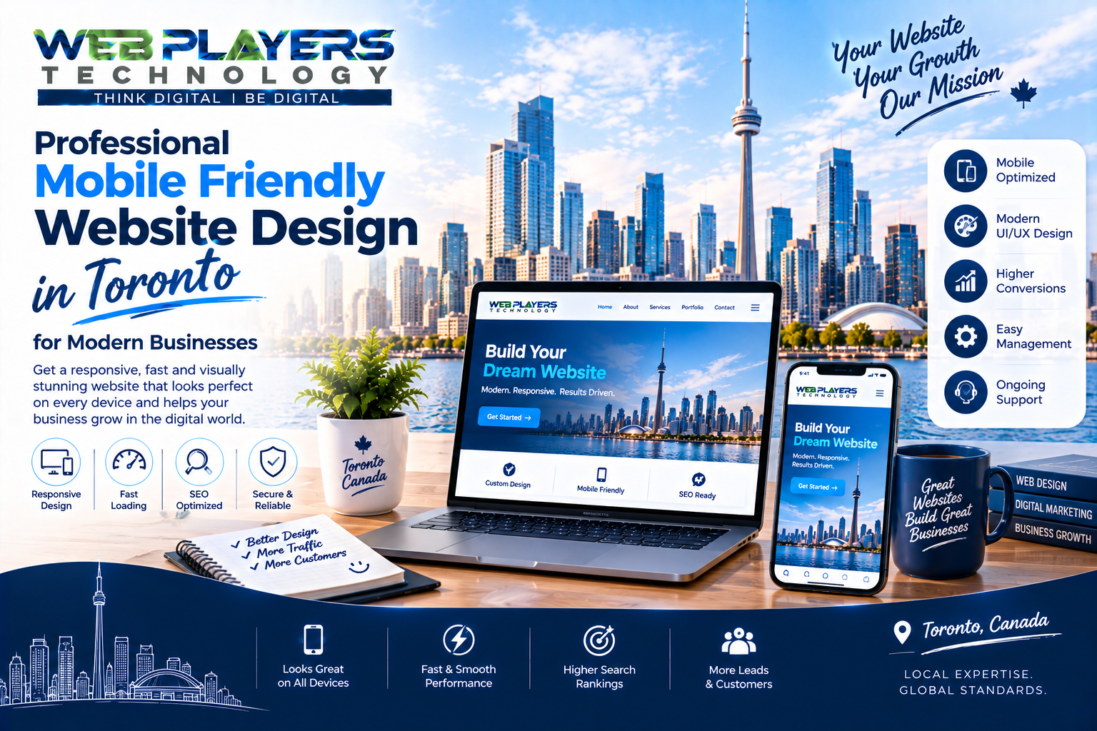
Professional Mobile Friendly Website Design In Toronto For Modern Businesses
A business website is no longer just an online address where customers can find a phone number or read about a company. It has become an important part of how people discover businesses, compare services, evaluate brands, and decide whether to get in touch.
For modern businesses in Toronto, this makes website quality especially important. Customers may discover a company through Google, social media, online advertising, or a recommendation and immediately open its website from a smartphone. If the website is difficult to use, slow to load, or poorly displayed on a smaller screen, a potential customer can quickly move on to another option.
Professional mobile friendly website design in Toronto for modern businesses focuses on creating websites that provide a smooth and consistent experience across smartphones, tablets, laptops, and desktop computers. It combines responsive design, clear content, simple navigation, strong visual presentation, and practical functionality to help businesses communicate effectively online.
Why Businesses Need a Mobile Friendly Website
People use their phones for almost everything online. They search for local businesses, compare products, read reviews, check services, find contact information, and make purchasing decisions from mobile devices.
A website that was designed primarily for desktop users may not provide the same experience on a phone. Text can become difficult to read, menus may be awkward to use, images may not fit correctly, and important buttons can become difficult to find.
A mobile-friendly website solves these problems by adapting the page to the visitor's screen.
Instead of forcing users to zoom in or move sideways across a page, responsive design allows content to adjust naturally. This makes browsing more comfortable and gives visitors a clearer path toward the information they need.
For a Toronto business, that convenience can make a meaningful difference when potential customers are comparing several companies online.
What Is Mobile Friendly Website Design?
Mobile friendly website design means creating a website that works effectively on mobile devices as well as larger screens.
Responsive layouts automatically adjust according to screen size. Images resize appropriately, content remains readable, navigation becomes easier to use, and buttons are designed for touch interaction.
However, a genuinely mobile-friendly website involves more than simply making the desktop version smaller.
The entire user journey needs to be considered.
A visitor should be able to open the website, understand what the business offers, find important information, and take the next step without unnecessary frustration.
That might mean calling the business, submitting an enquiry form, requesting a quote, booking an appointment, viewing products, or purchasing a service.
Mobile Website Design and User Experience
Good website design starts with understanding the people who will use the website.
A customer visiting from a smartphone does not want to fight with complicated navigation. They want answers quickly.
This is why professional web design pays attention to elements such as page structure, typography, spacing, buttons, menus, images, forms, and calls to action.
For example, a service business can place its primary services near the beginning of a page, explain the benefits clearly, and provide a visible contact option. An e-commerce company may focus on product categories, product images, pricing, reviews, and an easy checkout process.
The right structure depends on the business and its customers.
Responsive Website Design for Toronto Businesses
Toronto businesses serve a wide range of customers and industries. From restaurants and retail stores to professional services, technology companies, healthcare providers, real estate businesses, and growing startups, every organization has different website requirements.
Responsive website design provides the flexibility needed to serve these different audiences.
A website can maintain its branding and functionality across devices while adapting the layout to the available screen space.
This also means businesses do not have to create an entirely separate mobile website for every device. One well-planned responsive website can provide a consistent experience across multiple screen sizes.
How SEO Fits Into Website Design
Website design and SEO in Toronto should not be treated as completely separate activities.
A visually attractive website may look impressive, but it also needs to be understandable, accessible, technically sound, and useful to searchers.
SEO-friendly website design can include logical page structures, descriptive headings, clean navigation, relevant content, internal links, optimized images, mobile responsiveness, and technically sound pages.
Keyword research can also help businesses understand what potential customers are searching for. These insights can then influence page topics, service descriptions, blog content, and landing pages.
For example, a Toronto business offering website development might create dedicated pages around website design, responsive development, e-commerce development, and landing page development rather than trying to place every service on one page.
This gives users clearer information and provides search engines with a better understanding of the website.
Creating SEO Friendly Website Content
Design alone cannot make a website successful.
Visitors need useful content that answers their questions and explains why they should choose the business.
SEO-friendly content should sound natural and be written for people first. Important phrases can be incorporated where they make sense, but repeating the same keyword excessively can make the page difficult to read.
A strong website can combine service pages, informative blog posts, location-based content, case studies, testimonials, and helpful resources.
This creates more opportunities to answer customer questions while building a useful online presence.
The Importance of Landing Page Design
A business website may contain many pages, but not every marketing campaign should send visitors to the homepage.
This is where landing page design becomes useful.
A landing page is created around a specific goal. That goal could be generating leads, promoting a service, collecting enquiries, advertising a special offer, or encouraging visitors to schedule a consultation.
For example, a Toronto company running an advertising campaign for website development could direct visitors to a dedicated website design landing page rather than its general homepage.
The landing page can focus on the specific service, explain its benefits, provide supporting information, answer common concerns, and include a clear call to action.
When landing pages are designed for mobile devices, visitors who arrive through smartphones can interact with the page without struggling with layout or navigation.
Mobile Friendly Landing Pages for Advertising
Online advertising can bring highly targeted visitors to a business website. However, getting the click is only the beginning.
If someone clicks an advertisement from their phone and arrives at a slow or confusing landing page, the opportunity may be lost.
A mobile-friendly landing page should make the next step obvious.
The headline should match the campaign message, the content should remain easy to scan, and the call to action should be simple to use. Forms should avoid unnecessary fields, while images and other visual elements should be optimized for mobile performance.
This approach can create a more consistent journey from advertisement to website to enquiry.
Social Media Marketing and Website Design
Social media marketing has become another important way businesses attract website visitors.
Companies use platforms such as Instagram, Facebook, LinkedIn, TikTok, Pinterest, and YouTube to share content, promote services, build communities, and introduce their brands to potential customers.
However, social media and website design should not operate as completely separate marketing activities.
A social media post might generate interest, but the website needs to continue that conversation.
For example, a company could publish a social media post about its website development services and direct interested users to a dedicated service page or landing page. The page should use similar branding and messaging so the visitor immediately understands that they have reached the right place.
This consistency can create a smoother customer experience.
Building a Consistent Digital Brand
Modern customers may encounter a business several times before contacting it.
They might see an Instagram post, find the company through Google, read a blog article, visit a landing page, and later return through an advertisement.
Each interaction contributes to their perception of the brand.
A professionally designed website should therefore work alongside SEO and social media marketing to maintain consistent branding.
Colours, typography, imagery, messaging, and tone should f

Easy Social Media Marketing Services In Central Delhi For Small Businesses
Today, almost everyone uses social media. Some people watch Instagram reels, some enjoy Facebook posts, and others use YouTube to learn something new.But have you ever thought about how social media can help a small business?Imagine you own a caf&

Professional SEO Services In Auckland For Better Google Rankings
In today's digital marketplace, having a website is only the first step towards building a successful online business. Customers need to find your website when they search for products or services related to your business. This is where Profes
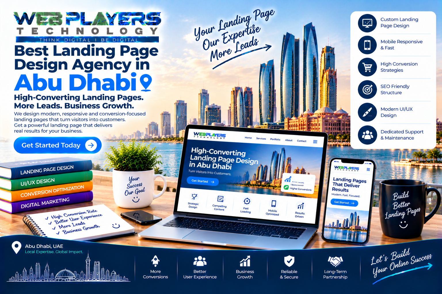
Best Landing Page Design Agency In Abu Dhabi For Business Growth
In today's competitive digital market, businesses need more than just an attractive website to connect with potential customers. They need a focused online experience that communicates their services clearly and encourages visitors to take act